|
Web Design Fonts
|
It would be great if all websites had the luxury to use any font they wanted but unlike print, font usage on
websites has different restrictions. When you choose a font to use from your computer, the design becomes static
after it is printed so anyone who receives it will see the same thing. However, on a website or mobile device
not all have the same fonts and browsers do not support all fonts so the design may change based on what
is available to the viewer.
It is important for websites to use web safe fonts so that the design integrity of a page can be maintained.
If a user with a device that does not have the font you selected visits your website, their operating system
will select a default font such as sans-serif or serif. When this happens, it not only affects the general
look of the font, but it may also cause alignment issues with images or awkward spacing. To prevent this from
happening, your website should use a font that is available to all users on all devices.
You may have noticed that there are many fonts pre-installed on your computer that you may recognize on other
computers as well. The issue here is that there are two widely used operating systems which are Windows and
Mac OS and each has their own sets of standard fonts.
|
|
|
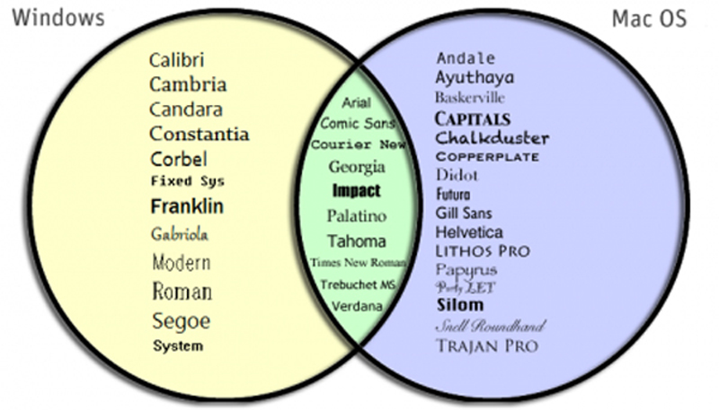
As you can see in the diagram above, though both systems have a good amount of standard pre-installed fonts,
they only have a few in common. The ones that are found in both circles are considered to be web safe. If
your site uses a font such as Calibri, Mac users may not see it. And if your site uses Futura, Windows users
may not see it. Arial will be seen just the way it is by users of either operating systems.
|
When creating a website or mobile app designers need to consider:
• Consistency: People view designs on different devices,
screens, and browsers, so there is a need to ensure sites and apps look the same across the different platforms.
• Performance: File sizes of web page designs can slow the load
time of a page, which can in turn lead to higher bounce rates. If elements of a design are loaded as individual
image files instead of as text, that can also increase a site’s payload.
• Resolution: Some designs and fonts do not scale or respond
well to the different screen sizes and pinch-and-zoom functionality of modern mobile browsing.
• Availability: If a designer is using a font other than a
web-safe font, chances are it will NOT be installed on every computer or device. This means a design might
have to default to a different, available font, and look different than intended.
• Search Engine Rank: Some designers convert text into an
image to ensure it displays the way they want, which can affect Search Engine Optimization (SEO). If more aspects
of your website’s design are loaded as images they are less readable to search engines than text, which can
affect the website ranking.
|
|
|